Problem Roulette Redesign
Redesign the practice summary page for UX and UI improvements.
UX/UI Redesign, Frontend Development
Redesign the practice summary page for UX and UI improvements.
UX/UI Redesign, Frontend Development

Problem Roulette is a tool collaborating with faculties from schools of University of Michigan to help students study and prepare for exams by practicing exercises from previous exams. Since 2017, Problem Roulette has served over 3 million questions to over 10 thousands students across 13 courses.
While designing and developing new features for Problem Roulette, our team also spend time iterating on the existing features to continue optimizing learners' experience and study efficiency with Problem Roulette. The task covered in this piece is to redesign the existing session summary page, the page that gives user a summary of their performance for a study session they just completed.
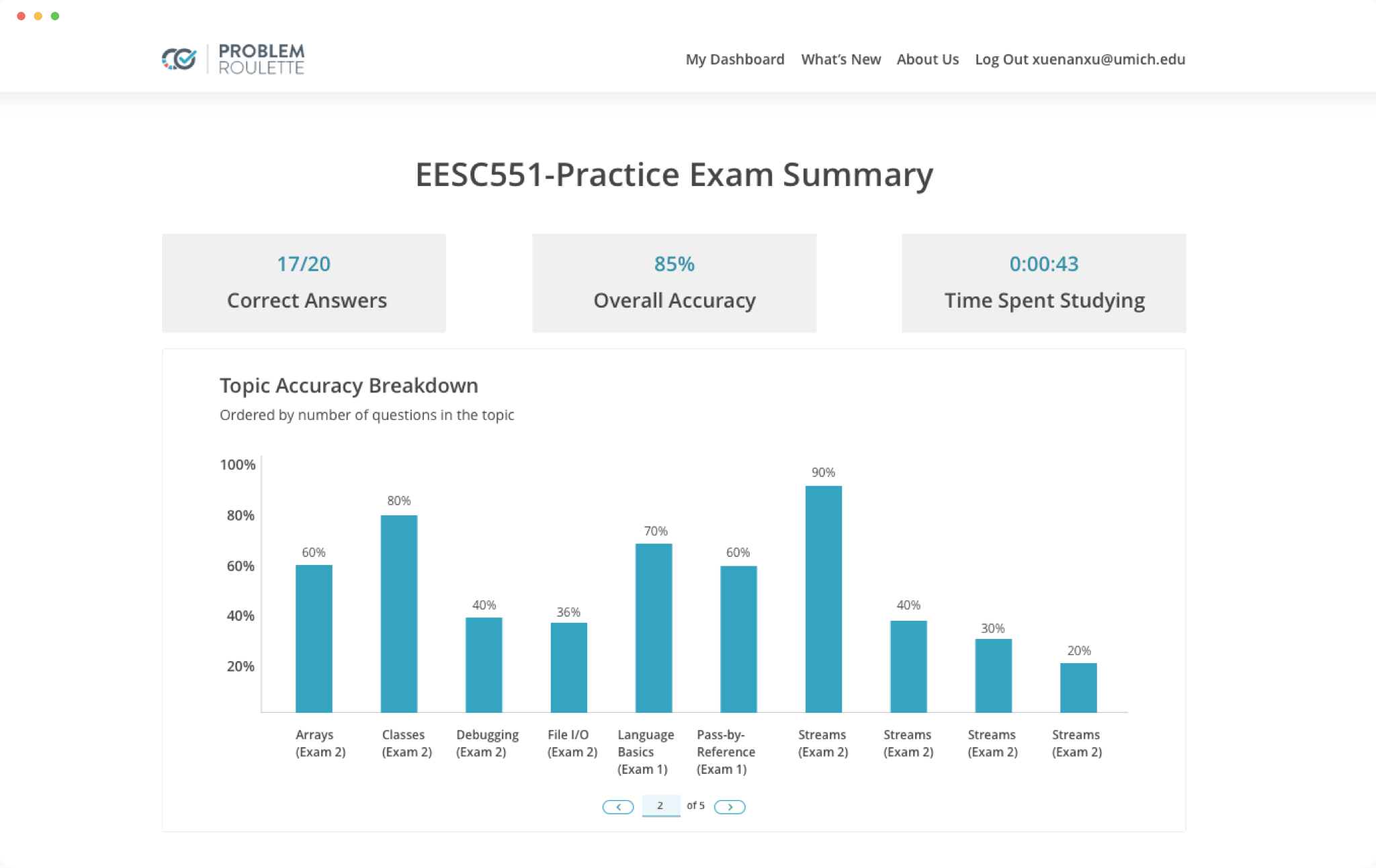
The redesign improved the UI style and interactions of the session summary page. Click through the prototype for an overview of the new design.
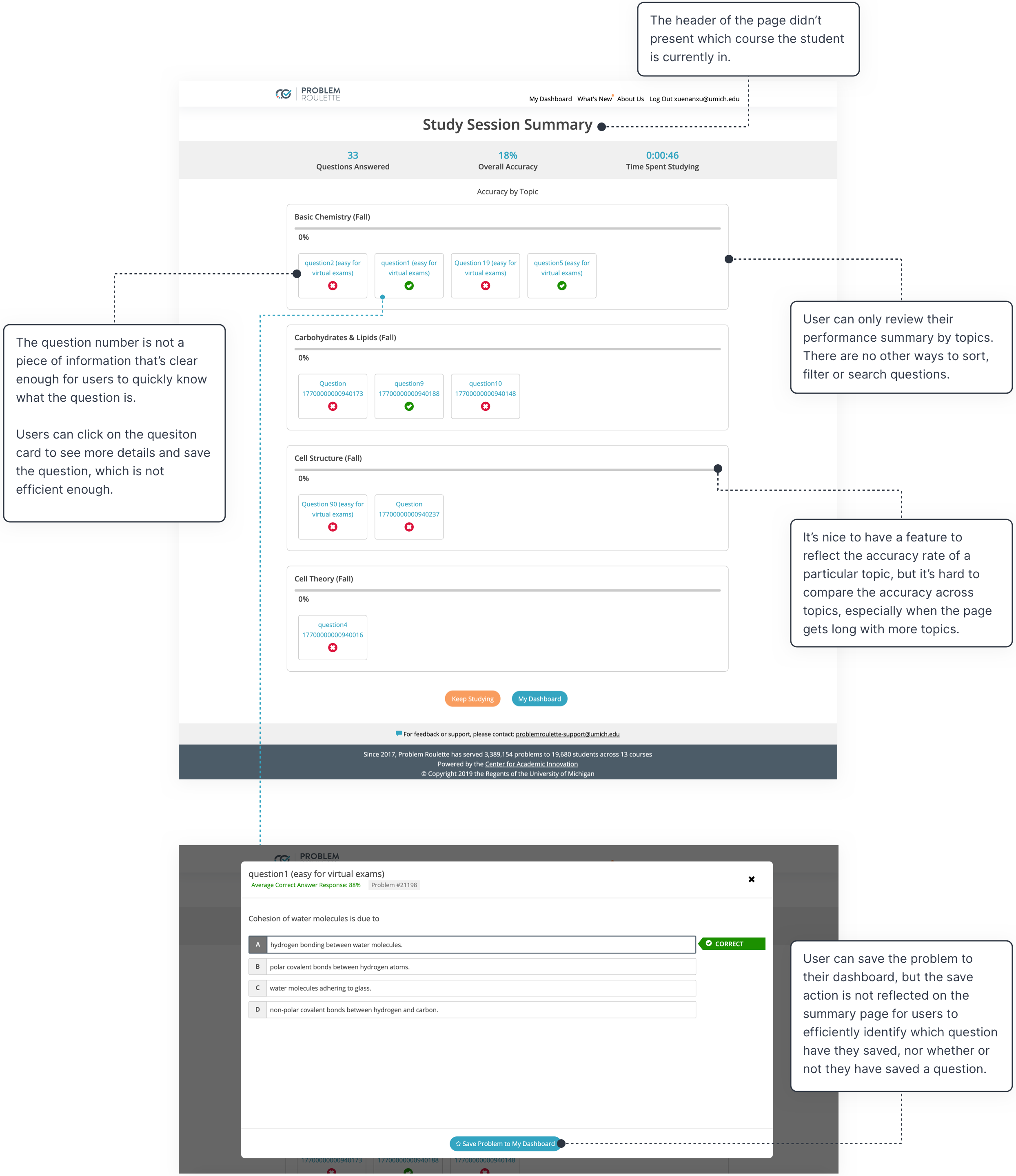
I started the redesign process by analyzing the current interface to identify where the user experience could improve and compare with the UI style of other interfaces.
Below is an overview of how I redesigned to solve the problems I identified on the current interface.
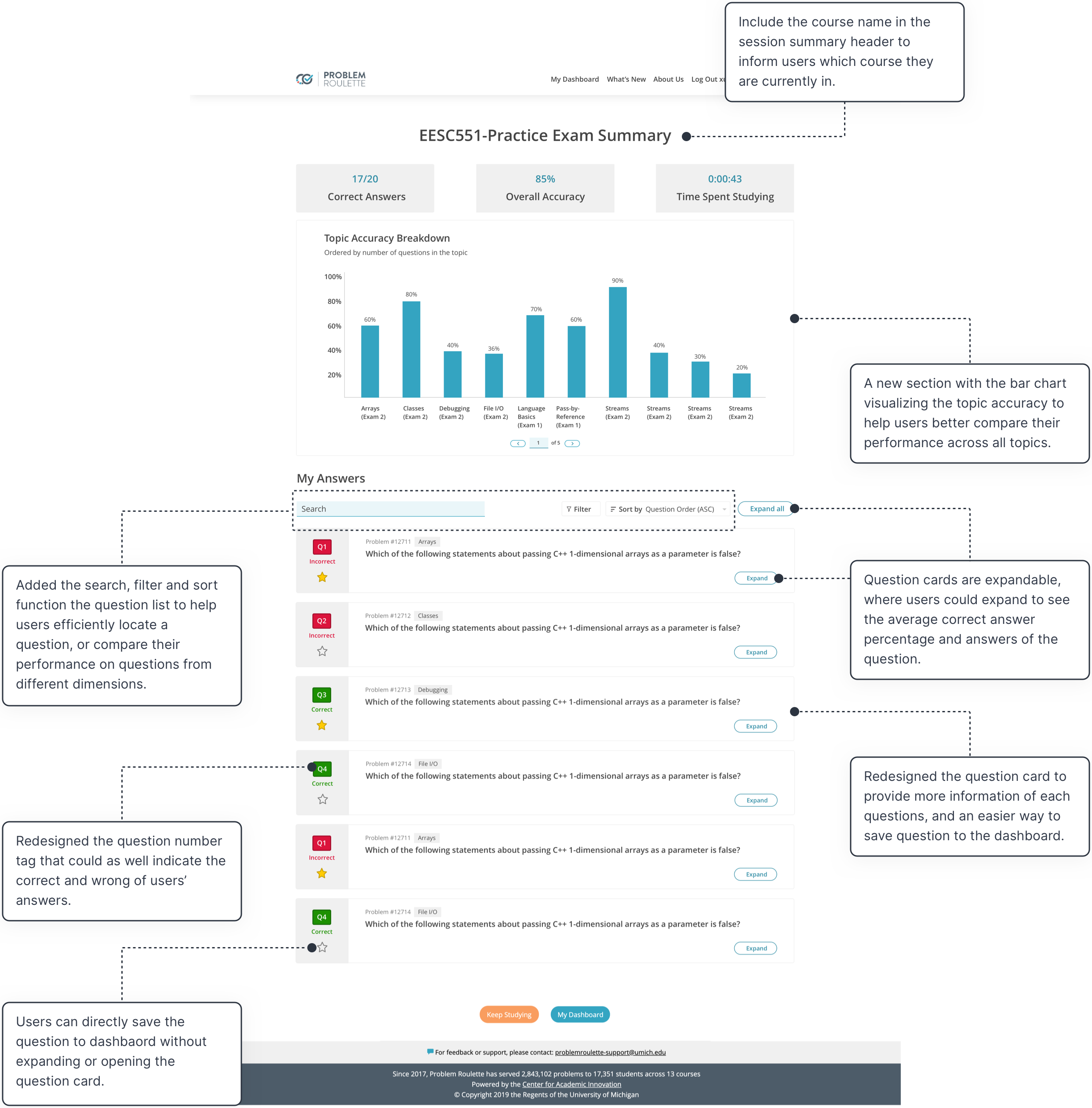
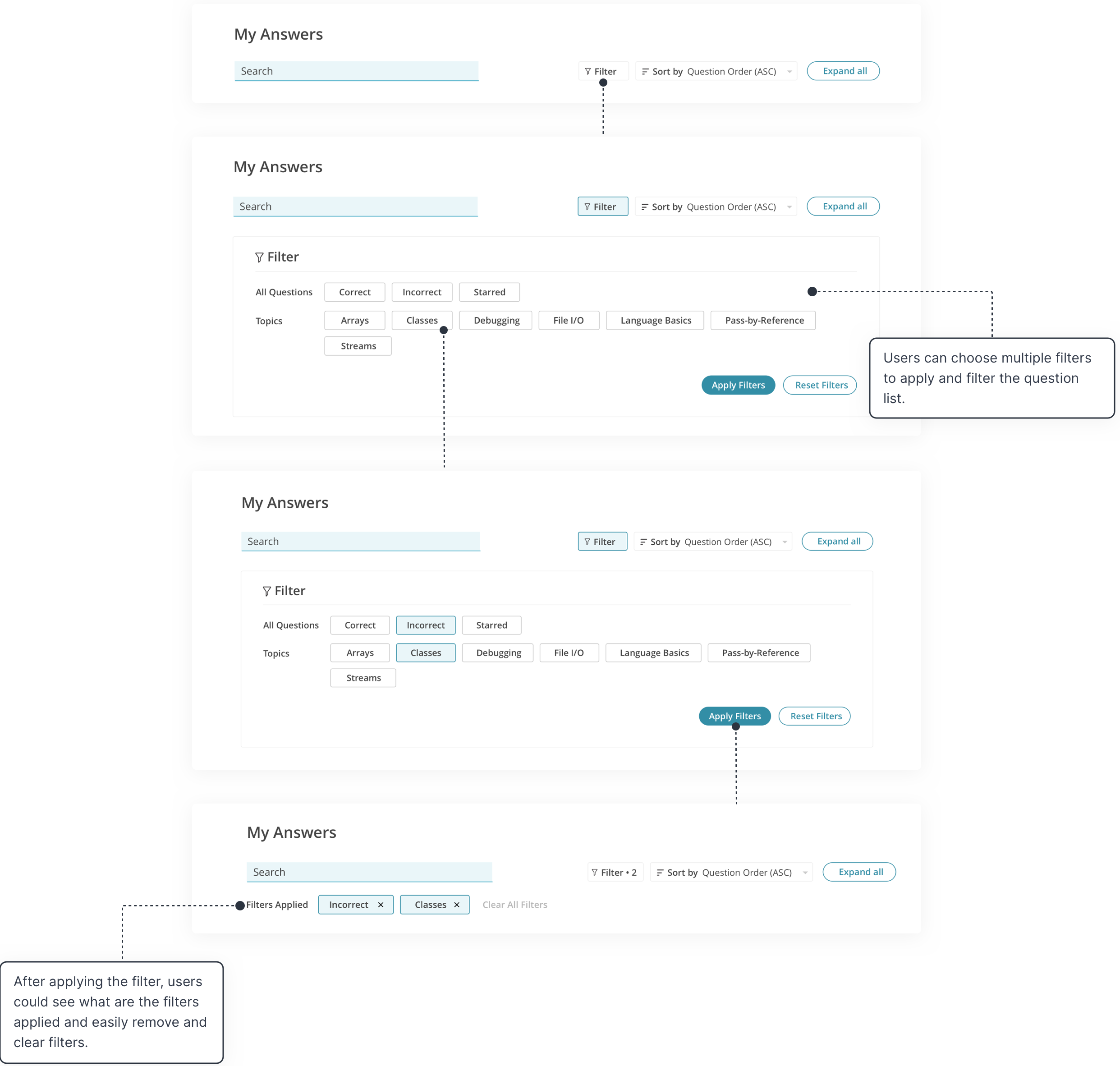
Users can select and apply multiple filters from different dimentions to the question list.
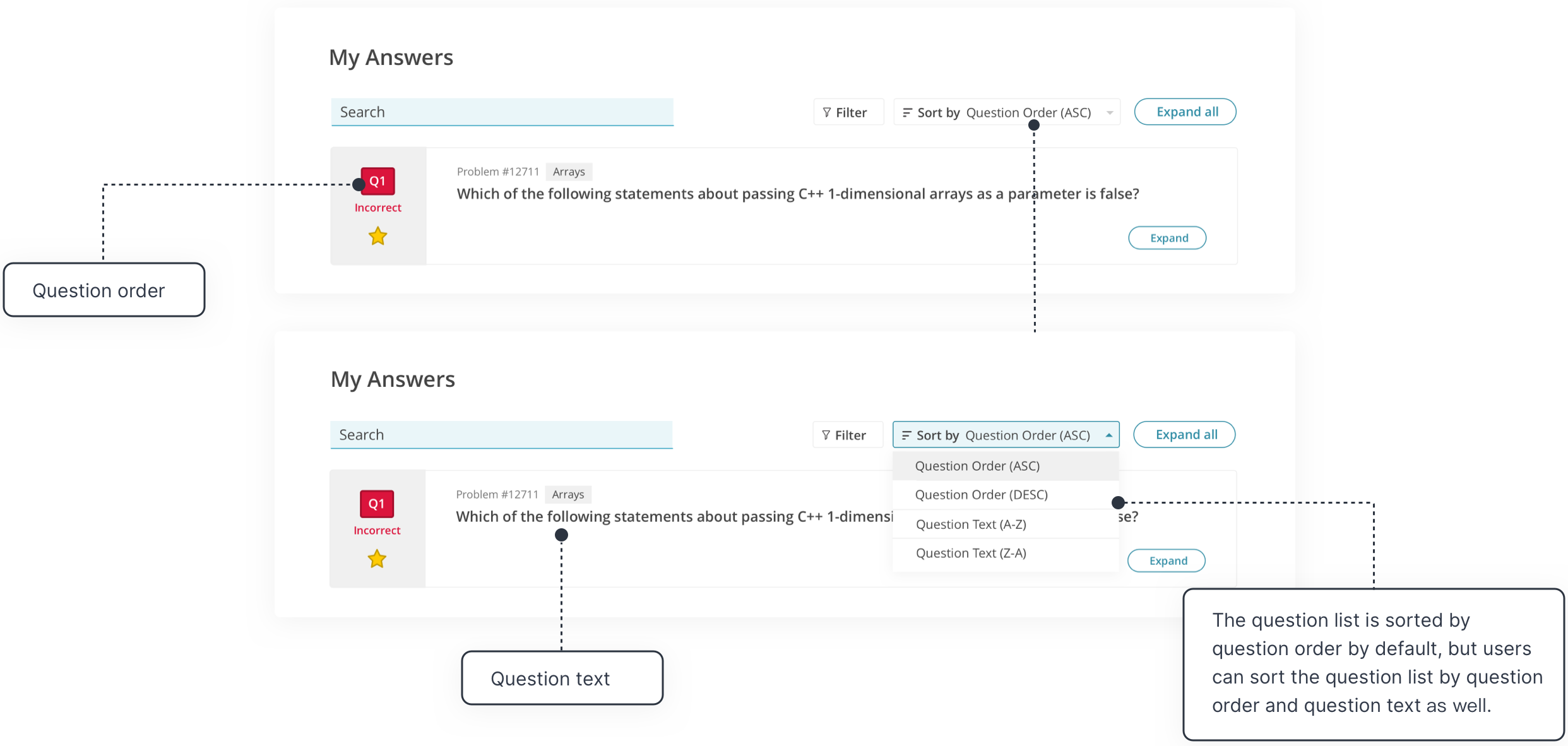
Users can sort the question list from two dimentions - question order and question text.
Users can save and unsave the question onto their course dashboard.

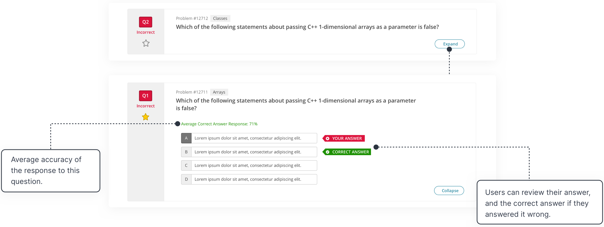
Users can expand the quesiton card to see more detailed information, such like the average accuracy of response, their answer(s) to the question and the correct answer of the question.
